AwesomeAwesome is not just an exclamation - it is a name for perfect window manager utilizing tiling windows concept. It can be used for X windows systems on the *nix and BSD systems. I'm using it now, and I would like to share awesome experience.
Background The idea of multiple windows shown at the same time on the single screen is known for times.
Curses,
TurboVision creates interfaces capable of showing pseudo-windows with ASCII characters. Bunch of software called terminal multiplexers (see
Terminal Multiplexers on Wikipedia) is used for showing several text program outputs on the same text terminal. The best use case I can see is
tailing several log files to monitor distributed activity in
runtime. Or I can run some commands in the active console, and watch their output (which goes to file :) ) on other virtual terminal.
Nowadays people mostly use graphical user interface. In the
Unixes X Window system makes all the low-level work on rendering data and basic manipulating windows. In the
Redmond-like
GUIs we got used to window decoration, overlapping windows,
task bar showing tasks being executed, ability to drag and
resize windows with mouse. All this stuff in the Unix world is done
by Window Manager (WM). There are
different WM's doing their job in different way.
You might have noticed monitor aspect ratio change trend. Monitors are going wider. Resolution goes higher. Have you ever tried maximizing any file manager on the 1920x1200 resolution? One may feel
uncomfortable and lost in such a wide space with lots of icons. There is not that much tasks that really require that much information shown on-screen
simultaneously. On the other side, if you open lots of windows to utilize informational space, you can run into problems with finding appropriate one.
Tiling window managersThe descendants of the terminal
multiplexers are
tiling window managers. General idea is to split the screen into non-overlapping areas, and put each window into appropriate area. With this concept, you can see all the information at the same time. And you don't need press Alt+Tab all the time :).
Tiling concept is extended with
various features, such as different focus models, static or dynamic window arrangement, virtual desktops/tags, tabs to arrange windows in the single slot, and much, much more.
I am using
Awesome window manager.
Awesome features- Dynamic layout model. When new window gets opened you do not need to position it somewhere manually. Awesome decides where to put it based on the windows role, current configuration and layout.
- Full keyboard control. You can do everything with keyboard. Move focus forward/backward, switch layouts, rearrange windows, change cell size, etc...
- Full mouse control. In addition to keyboard, you can do all the stuff mentioned above with your mouse. It is very handy when working with graphic editors, for example.
- Tags. You might have heard of virtual desktops - concept, used heavily in Unix desktop environments. Tags are different. Instead of setting single virtual desktop for window you can assign several tags to it, and window will be shown in each of these tags. This feature allows you to show some important windows on all the tags (so they are visible all the time)
- Layout models. Awesome allows to assign different layouts for tags. Windows can be arranged vertically, horizontally, full-screen, maximized, centered (active window is in center of screen, all other are in background tiled vertically), spiral, flying. The least one is the layout all of us got used to - overlapping windows. Yes, for some tasks it is very handy.
- Performance. Awesome does no windows decoration. No borders, no headers. Awesome uses XCB - the fastest way of talking to X server by now. Size of the program is 8 MB. Even when I do full compilation of my project, and both kernels are fully loaded, I can manage windows normally.
- Programmability. Awesome itself is written in C, but all less important features (menu, key bindings, tag switcher, task bar, tray icon, clock, etc...) are written in Lua - scripting language. You can easily change anything you want. This does not even require recompilation.
ScreenshotsHere are some screenshots made on my workstation.
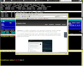
1. Vertical layout. Red border across top window (
FireFox) indicates focus. Top line is the
task bar. Small icon is the menu icon, 1-9 are tags.
Taskbar is long, and spans across all free space. Clock is the widget i wrote myself in
Lua. The lease element is the system tray having
Skype and Pidgin icon.
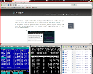
2. Dual-monitor setup. The left screen has several
IM windows with horizontal tag layout, the right part has
Thunderbird and terminal opened. Two monitors are my laptop primary screen (15" 1680x1050) and external Dell monitor (24" 1680x1050). The Awesome setup shown here is outdated for me.

3. Current layout in centered mode. One window is in center, but allows seeing other. Yellow border is a mark border. You can perform single operation to several marked windows. So, window group operations are supported in Awesome, too.

Hope this posting may help someone find own way :) at least in computer interfaces.


 picture
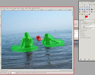 we are going to enhance this picture with just single effect applied. I already have LQR plug-in installed. If you wish to install it for your Gimp, go here.
 And this is the image after effect application. Just after single action, without sitting for hours and clone-stamping picture. Et voila.
 2. Dual-monitor setup. The left screen has several IM windows with horizontal tag layout, the right part has Thunderbird and terminal opened. Two monitors are my laptop primary screen (15" 1680x1050) and external Dell monitor (24" 1680x1050). The Awesome setup shown here is outdated for me.
 3. Current layout in centered mode. One window is in center, but allows seeing other. Yellow border is a mark border. You can perform single operation to several marked windows. So, window group operations are supported in Awesome, too.